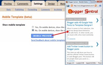
That’s right, Blogger is now mobile-friendly. Once activated, Blogger will automatically redirect to a mobile template (with a specially formatted layout suited for small screen sizes), whenever a visitor access your blog from a mobile device. To enjoy this new feature, all you have to do is activate the mobile template option.
I. How to enable mobile template
- Log in to Blogger (opens in a new tab/window).
- Go to Dashboard > Settings > Email & Mobile.

- Before you do anything else, you might want check out how the mobile version of your blog would’ve looked like. Do this by clicking the PREVIEW button.
- To opt for showing the mobile version on mobile devices, just click the first radio button: “Yes. Show mobile template on mobile devices.”.
- Update Dec 2011: Choose your mobile template by clicking the Choose mobile template dropdown menu and select from 6 different templates.
- Don’t forget to scroll down the page and click SAVE SETTINGS.
II. Feature highlights
Below are some feature highlights as described in Blogger In Draft blog.
- Automatic redirection
Blogger checks if your blog is accessed from a mobile device, and if it does, redirects it to the mobile template. For now Blogger only supports WebKit-based mobile browsers. - Template support
Blogger is initially supports Template Designer’s Simple and Awesome templates (6 variants each). If you have used one of these templates, your mobile view will be rendered in the same style as your desktop view. Some gadgets such as Header, Blog, Profile, AdSense, Attribution are also supported. Other template variants will be rendered as Simple. - Adsense ads
If you have AdSense gadget ads or inline ads installed, they will be displayed at the top of the post pages and at the bottom of the index page.
Blogger Sentral uses HTML/Javascript and manually added Adsense ads, so I guess you won’t be seeing them when viewed on your smartphone. - Comments and videos
You can to make comments and watch videos as usual.

No comments:
Post a Comment